
Calibration can Make Your Images Pop!
Last but not least…!
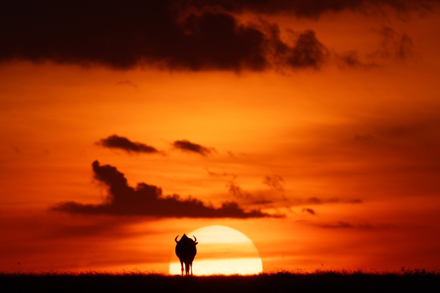
Miss Saigon (with Blue Primary Saturation at +100)
Calibration might be the last panel in the Lightroom Develop module, but it’s by no means the least useful. I often use the Blue Primary Saturation slider to make my images ‘pop’', and you can do the same!
What’s it for?
The word ‘calibration’ makes it sound as though this panel is just for controlling the colour balance on your monitor, and that’s how it may have started, but it’s a powerful tool in its own right.
There are five controls available:
Process Version dropdown menu
Shadows Tint slider
Red Primary (Hue and Saturation sliders)
Green Primary (Hue and Saturation sliders)
Blue Primary (Hue and Saturation sliders)
Process Version
The Process Version is the version of the software that Lightroom uses to render photos. The dropdown menu tells you which version is currently being used, and you can opt to change that if you want to.
Normally, you’ll update the version to the latest one to ensure you have access to the latest features. This is especially useful if you have old photos that you think might benefit from a further edit using more recent Lightroom features, such as masking.
You can roll back the Process Version if necessary, but that means completely altering the photo, so I wouldn’t advise it!
Shadows Tint
The Shadows Tint slider lets you play with the hue of the shadows, from green to magenta. I don’t find this particularly useful, and I use the Color Grading panel to adjust shadows and highlights. However, it’s an extra option if you need it.
Red/Blue/Green Primary
The Red, Blue and Green Primary Hue and Saturation sliders are the most important Calibration controls. Of these, I use the Blue Primary Saturation slider the most, but it depends on the colour balance in each specific image.
Red, blue and green are the primary colours in the RGB colour space (hence the name!), so the sliders give you control over the hue and saturation of all the colours in the image by focusing on the foundations.
‘Hue’ means the tint of a specific colour. That means you can make the reds more orangey or purplish, for example. It’s similar to the Hue control in the Color Mixer panel.
‘Saturation’ means the richness of the colour, and it’s similar to the Saturation control in the Color Mixer panel or the Saturation slider in the Basic panel.
What’s special about these sliders is that they affect both the primary and complementary colours in the RGB additive colour model:
The red sliders affect both red and cyan.
The green sliders affect both green and magenta.
The blue sliders affect both blue and yellow.
This is very useful, as we shall see…
How do you use it?
Playing with Calibration should be left until last in your editing workflow to avoid unexpected results. As always, you shouldn’t overdo it as that might make your images look unnatural.
I don’t have any hard and fast rules about what I will and won’t do in post, but I do try to make my photos look ‘realistic’—rather than ‘naturalistic’. In other words, they should look like the real world even if they’re not exactly a ‘true and fair’ view of the scene I captured at a particular moment!
Deciding on the ‘correct’ hue and saturation levels is obviously a very subjective process, so there’s no right or wrong way to go about it. However, it’s advisable to be reasonably consistent in your edits. If you’re not, then your images won’t go together very well.
Having said that, there are obviously some times of day that need special treatment, such as sunrise and sunset. I find the Blue Primary Saturation slider is a good way to add richness to the colours without making the photo look fake.
Let’s have a look at a few examples…

"Tiger, tiger, burning bright…" (final version with Blue Primary Saturation at +100)


As you can see from the main image, the light is much warmer at +100 Blue Primary Saturation. That might not be to everybody’s taste, so I’ve included thumbnails at -100, -50, 0 and +50 to show the differences. (You can click on them to make them larger.) Which one do you prefer…?!
To show what happens if you alter the Red Primary Saturation slider, here’s an image of a cheetah. I eventually settled on a value of +75.

Cheetahs Never Win
However, here are the other possibilities at the same intervals as before:


You can also play with all three sliders if you wish. Here’s a photo of a leopard shown before and after adjustments to the calibration. In the final version, I boosted the primary colour saturation by +25 (red), +25 (green) and +50 (blue).


Verdict
And there you go. I hope this article has given you another tool to make your images pop—whatever that means! It’s not something you should overdo, but it’s a useful technique if you think of it as the icing on the cake.
If you’d like to order a framed print of one of my wildlife photographs, please visit the Prints page.
If you’d like to book a lesson or order an online photography course, please visit my Lessons and Courses pages.