
How to Edit a Photo to Look Like Film
Guest post
In recent years, film photography has experienced a remarkable resurgence. What was once considered outdated or impractical has returned as a powerful creative choice, embraced by photographers seeking authenticity, character, and emotional depth in their images. From fashion editorials and wedding photography to personal storytelling and lifestyle content, the film look has become synonymous with warmth, nostalgia, and timeless appeal.
Film images feel different. They are imperfect in a way that feels human. Slight colour shifts, soft contrast, visible grain, and gentle tonal transitions create photographs that feel lived-in rather than manufactured. There is also a sense of unpredictability: you don’t always know exactly what you will get, and that element of surprise often adds to the emotional impact. Even the limitations of film—fewer shots, slower workflow, and a need to be more intentional—shape the final result in a way that many artists find inspiring. Unlike the ultra-clean aesthetic often associated with modern digital images, film tends to feel softer and more forgiving, especially in the way it renders skin and natural light. That softness can make everyday scenes feel more intimate, as if they belong to a memory rather than a moment.
While shooting with analogue cameras is one way to achieve this aesthetic, digital photography—when edited thoughtfully—can capture much of the same magic. The key is to move away from overly sharp, clean, high-contrast edits and instead aim for a calmer, more natural rendering. Film rarely looks “perfect,” and that is exactly why it feels so believable. Small choices like lowering clarity, gently lifting blacks, warming highlights, or reducing saturation in specific colour ranges can dramatically shift the mood without making the edit look artificial. Another important factor is consistency: film images often have a cohesive palette across an entire roll, so building a repeatable workflow (or a custom preset) helps your digital work feel more intentional and unified. Subtle imperfections—like a hint of haze, light grain, or a slight fade in the shadows—can add character when used with restraint.
With the right approach and careful editing in tools like Adobe Lightroom, it’s entirely possible to recreate the charm of film photography using digital files. This guide walks you through the essential techniques needed to edit a photo to look like film, illustrated through a practical example. From colour grading and contrast control to grain and subtle finishing touches, you’ll learn how to transform a clean digital image into something rich with atmosphere and character. The goal isn’t to “trick” anyone into thinking an image was shot on film—it’s to borrow the emotional language of film and apply it in a way that supports your subject and story. When done well, the result feels natural, not forced.
One of the most important things to keep in mind is that “film look” is not a single, universal style. Kodak Portra feels very different from Fujifilm Superia, and classic black-and-white stocks like Ilford HP5 have their own contrast and grain signature. That’s why studying references matters: look at real film scans, notice how skin tones behave, how reds and greens shift, and how highlights roll off instead of turning pure white. Also pay attention to the overall exposure—film images are often slightly overexposed, which contributes to that airy softness. By approaching editing as a process of observation rather than imitation, you can create results that feel believable, consistent, and uniquely yours.
Understanding What Makes Film Photography Special
Before diving into editing, it’s important to understand why film looks the way it does. Film photography is shaped by physical processes: light interacting with chemical emulsions, grain structures formed by silver halide crystals, and colour responses unique to each film stock. Different films also carry distinct personalities—some lean toward warm skin tones, others emphasise greens or blues, while certain stocks are known for muted saturation and creamy highlights. Scanning also plays a role: film labs and scanners interpret negatives differently, which is why two scans of the same frame can look slightly different. These variations are part of the charm and help explain why film has so much depth.
Unlike digital sensors, film handles highlights more gently, often preserving detail rather than clipping harshly. Shadows tend to retain softness, and colours are rendered with subtle shifts rather than clinical precision. These characteristics are what give film its organic, emotional quality—and they are exactly what we aim to replicate in post-processing.
Editing a photo to look like film is less about applying extreme effects and more about restraint, balance, and intentional imperfection.
1. Choose the Right Photo
While technically any image can be edited to resemble film, the starting photo makes a significant difference to the final result. Not every digital image lends itself naturally to this aesthetic.
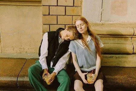
In our example, we selected a photograph featuring soft natural light, warm tones, and organic elements. The lighting falls gently across the subjects’ faces, avoiding harsh shadows or blown highlights. The background contains muted colours and natural textures, which work beautifully with film-inspired colour grading.
When choosing a photo for film-style editing, look for:
● Soft or diffused lighting (golden hour, window light, overcast days)
● Balanced exposure without extreme highlights or shadows
● Natural colour palettes
● Clean, uncluttered compositions
● Textures such as skin, fabric, foliage, or grain-friendly surfaces
Avoid images with harsh midday light, heavy artificial lighting, or overly busy backgrounds, as these can make achieving a cohesive film look more challenging.
2. Adjust the Colour Tone
Colour grading is the heart of film-style editing. Different film stocks are known for their distinctive colour profiles—Kodak Gold’s warm yellows, Portra’s gentle skin tones, Fuji’s cooler greens, and so on.
To emulate this in Lightroom, we begin with white balance and HSL (Hue, Saturation, Luminance) adjustments.
Temperature and Tint
For our image, we increased the Temperature to +15 to introduce a warm, nostalgic tone reminiscent of classic Kodak stocks. This warmth enhances skin tones and complements earthy backgrounds without feeling artificial.
The Tint was left at 0, maintaining a neutral balance and avoiding unwanted green or magenta casts. In film-style editing, subtlety is key—overcorrecting tint can quickly make an image feel unnatural.
HSL Adjustments
Fine-tuning individual colours helps recreate the muted vibrancy typical of film.
In our example:
● Reds (Hue +20): Softens skin tones and reduces digital harshness.
● Blues (Saturation -17): Tames overly strong skies or clothing.
● Purples (Saturation -24): Prevents unnatural colour dominance.
● Yellows (Luminance +15): Adds brightness and warmth without intensity.
● Greens (Luminance +8): Keeps foliage fresh but understated.
These adjustments work together to create harmony across the image, ensuring no single colour dominates.
3. Soften the Contrast
One of the most noticeable differences between digital and film images is contrast handling. Digital cameras often produce sharp contrast with deep blacks and bright highlights. Film, by comparison, transitions more gently between tones.
Tone Curve Adjustments
Using the Tone Curve panel, we created a gentle “S” curve:
● Lifted the shadows slightly to retain detail
● Lowered the highlights to avoid harsh brightness
This approach softens contrast while maintaining depth, particularly in skin tones and fabric textures.
Whites and Blacks
We reduced:
● Whites to -5
● Blacks to -10
These small adjustments prevent extreme tonal values, ensuring the image feels balanced and natural rather than punchy or clinical.
4. Add Film Grain
Grain is one of the defining characteristics of film photography. Unlike digital noise, film grain feels organic and textured, adding depth rather than distraction.
In Lightroom’s Grain panel, we applied:
● Amount: 37 – noticeable but not overpowering
● Size: 53 – medium grain, similar to ISO 400 film
● Roughness: 38 – adds irregularity and authenticity
Grain should enhance the image, not dominate it. When applied correctly, it gives photos a tactile quality reminiscent of printed film photographs.
5. Reduce Clarity for a Softer Look
Clarity enhances midtone contrast, which is often excessive in digital images. Reducing clarity slightly helps replicate the softer rendering of film lenses and emulsions.
For our image, we set:
● Clarity to -10
This adjustment subtly smooths textures and reduces harshness, particularly in skin tones, while maintaining overall sharpness. The result is a gentle, dreamy quality without losing detail.
6. Optional: Apply a Subtle Vignette
Vignetting was common in film photography due to lens limitations and optical characteristics. When applied carefully, it can enhance composition by guiding the viewer’s eye.
● Amount: Set to -20 for a mild darkening of the edges.
● Midpoint: Adjusted to 38 to control how far the vignette reaches into the image.
● Feather: Set to 100 for a smooth transition that avoids harsh lines.
This creates a soft, natural darkening at the edges, framing the subjects without drawing attention to the effect itself.
Additional Film-Inspired Tweaks (Optional)
To push the film look further, consider:
● Slightly reducing Sharpness
● Adding subtle colour grading in the Colour Grading panel (warm highlights, cooler shadows)
● Lifting the black point slightly in the Tone Curve for faded blacks
● Avoiding excessive saturation or clarity
Film editing is about restraint. Less is almost always more.
Quick and Easy Option: Use Film Presets
For photographers who want consistent results or a faster workflow, film presets are an excellent option. Presets replicate the characteristics of specific film stocks with one click, providing a strong starting point for further refinement.
A reliable source for high-quality film presets is The Presets Room. Their collection includes thoughtfully crafted presets designed to emulate classic film aesthetics while remaining flexible for different lighting conditions. Whether you’re a beginner or an experienced photographer, presets can streamline your editing process and help you develop a cohesive visual style.
Presets also serve as learning tools—by analysing their settings, you can better understand how film looks are built.
Final Thoughts: Embracing Imperfection
Editing photos to look like film isn’t about copying the past—it’s about capturing emotion, texture, and authenticity in a digital world. Film-inspired editing encourages photographers to slow down, make intentional choices, and embrace subtle imperfections.
With the techniques outlined in this guide—careful colour grading, softened contrast, added grain, and thoughtful finishing touches—you can transform your digital images into photographs that feel timeless and expressive.
Film isn’t perfect. And that’s exactly why it still resonates.
If you’d like to order a framed print of one of my wildlife photographs, please visit the Prints page.
If you’d like to book a lesson or order an online photography course, please visit my Lessons and Courses pages.